How Mobile UX Impacts eCommerce Sales
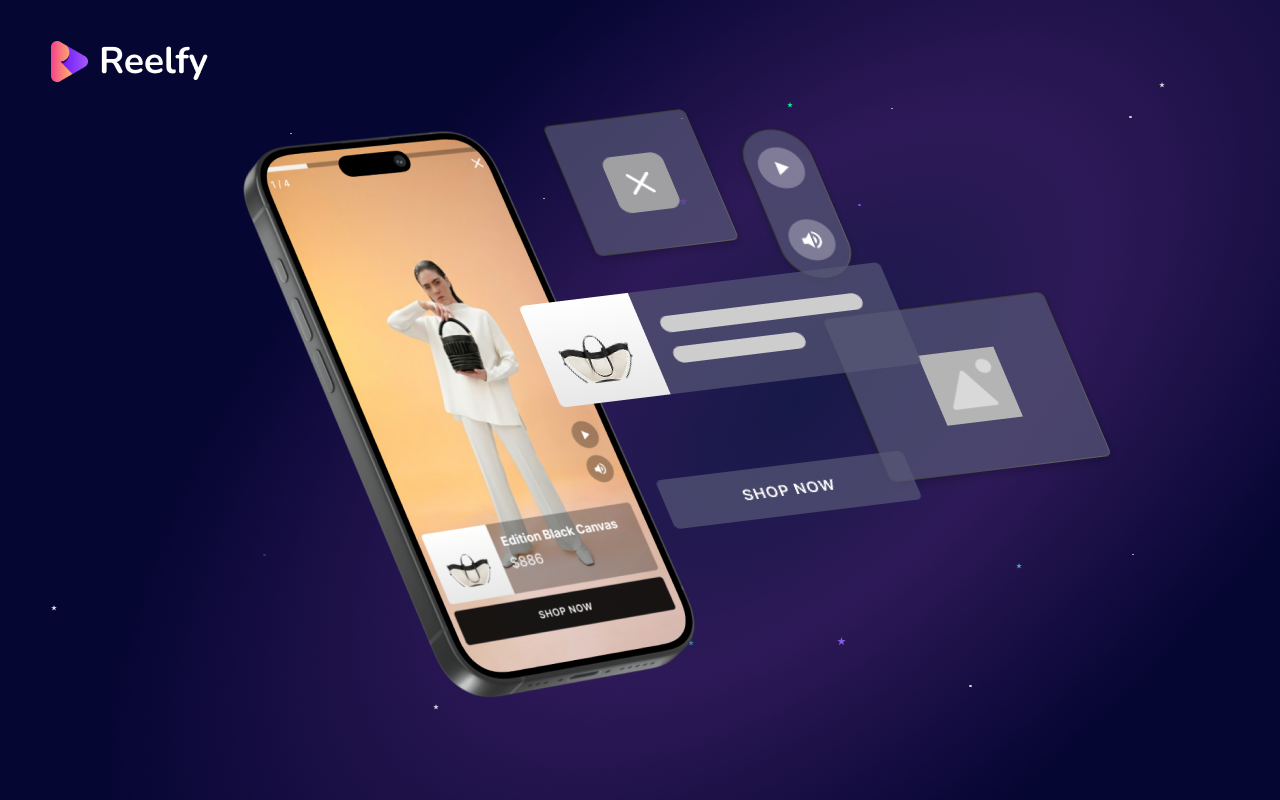
A poor mobile experience costs sales every day. Learn how improving your mobile UX can reduce friction, build trust, and increase conversions for your online store.
Have you ever opened an online store on your phone and instantly left because the site felt hard to use?
Maybe the buttons were too small. Maybe popups covered the screen. Maybe checkout felt confusing.
Most shoppers will not complain. They simply leave.
That is why mobile UX matters.
Mobile UX means how easy and smooth your website feels on a phone. A better mobile experience keeps shoppers engaged and helps more people complete purchases.
Why Mobile UX Matters
Today, most eCommerce traffic comes from mobile devices.
If your store feels slow, cluttered, or difficult to navigate, shoppers leave quickly.
Poor mobile UX often leads to:
- Higher bounce rates
- More abandoned carts
- Lower conversion rates
- Reduced trust in your brand
But even small improvements can increase sales.
When shoppers can browse easily, find products quickly, and checkout smoothly, they buy more often.
Common Mobile UX Problems
1. Small Buttons and Hard-to-Read Text
Mobile shoppers should not need to zoom in or struggle to tap buttons.
Fixes:
- Use larger fonts
- Increase button size
- Add more spacing between elements
2. Too Many Popups
Aggressive popups interrupt the shopping experience.
Fixes:
- Show fewer popups
- Delay popups until users engage
- Make close buttons easy to tap
3. Complicated Checkout
Long checkout flows cause cart abandonment.
Fixes:
- Reduce form fields
- Enable autofill
- Offer fast payment options like Apple Pay and Google Pay
4. Poor Navigation
If shoppers cannot find products quickly, they leave.
Fixes:
- Keep menus simple
- Add a visible search bar
- Use clear product categories
How Shoppable Video Helps Mobile UX
Video helps mobile shoppers understand products faster.
Instead of reading long descriptions, users can quickly see how products look and work.
But video should not slow down your store.
A better setup includes:
- Showing a poster image first
- Loading videos only after interaction
- Using vertical videos for mobile
- Lazy-loading video sections below the fold
This creates a smoother shopping experience while keeping pages fast.
Simple Mobile UX Improvements
You do not need a full redesign.
Start with these quick wins:
- Increase button sizes
- Simplify navigation
- Remove unnecessary popups
- Improve product page spacing
- Speed up mobile checkout
- Compress large images
- Test your store on a real phone
Small improvements can create noticeable conversion gains.
How Better UX Increases Revenue
Let’s keep the math simple.
Your store gets 50,000 monthly mobile visitors.
Your mobile conversion rate is 1.5%.
Your average order value is $80.
Monthly mobile revenue:
50,000 × 1.5% × $80 = $60,000
Now imagine your mobile UX improves and conversion rises to 1.8%.
New revenue:
50,000 × 1.8% × $80 = $72,000
That is an extra $12,000 per month from a smoother shopping experience.
Shopify Tips for Better Mobile UX
If you use Shopify:
- Remove unused apps
- Avoid heavy widgets
- Compress images
- Keep product pages clean
- Test your cart drawer on mobile
- Use lightweight video embeds
Always test your store after installing new apps or updating your theme.
Final Word
Mobile UX is not just about design.
It is about making shopping easier.
When your store feels simple and smooth on mobile, shoppers stay longer, trust your brand more, and complete more purchases.
Even small UX improvements can lead to meaningful sales growth.
Want to improve your mobile shopping experience with shoppable video?

Tinh PX
administratorFrom the Customer Care Department